If you are just tuning into this series you can check out the introduction here and the Living Room here.
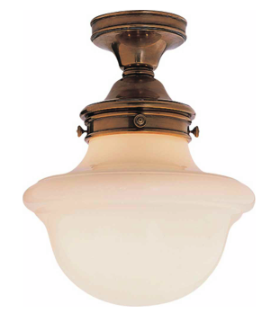
The first thing to figure out for this area was the entryway light. Erin found some beautiful options that brought in that brassy/gold we wanted to incorporate throughout her house.
She loved the bottom option but was a little worried about the price. We convinced here we would work it out within the budget! As we go through a room we usually decide which items we'll save on and which items we'll splurge on.
Now onto the entryway table!
As I mentioned in the initial consult post we didn't have a lot of space for the table. When you opened the front door and the french doors our width quickly diminished. So we set out to source some smaller tables. Here were a few we sent over for consideration.
She wasn't totally in love with any of the options. This is normal as a designer to have things like this happen so it's really not a huge deal. It's always good to get feedback from clients so we can move forward with better options. I always tell them, "our feelings will not be hurt! just be honest!". So I sent over round two of options:
After taking a look at the new options it was a tie between the west elm rustic storage one and the Ballard Newport Demilune. It's funny because they were very opposite in style. The Demilune table was 38" which was ideal for the space so that seemed to be the obvious choice but she was a little worried it would look too traditional. I felt like it would be fine in the space. I like to mix traditional with transitional and modern all the time! If it looks good it looks good.
Once we decided on the table and light we moved on to art and the rug.
Originally we had thought of framing four prints from this calendar to save money.
I framed a Cavallini Calendar in my bedroom and in the model home I decorated.
She wasn't a huge fan of the calendar idea mostly because it just felt too traditional. She sent me this link to give a better idea of the type of floral she liked.
Having this reference was really helpful so I sent over some new more modern options:
After seeing some new options she liked The Home Sweet Home print best but wasn't in love with it. She did like flowers and inspirational type quotes. She sent this link over as one that she loved:
I thought we might be able to do it. We decided to just go with this one print over the entryway table instead of a grouping of four. But 11 x 14 was the largest size the print came in. I suggested we buy this frame to make the art feel bigger.
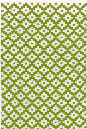
We had a custom mat made for the 11 x 14 art so it felt like the entire piece was a custom piece of art. Now we needed to decide on a rug! I always always always recommend an indoor/outdoor rug for an entryway especially if you have kids. Even if you have guests take off shoes your front rug is sure to get dirty. Keeping that in mind I sent over these options:
Her favorite choices were the top diamond and bottom stripe option. She just couldn't decide and I thought both options would work! I sent over these mock-ups to help make up her mind:
A mock-up like this can work wonders for a client. It's so much easier to visualize! She chose the gray striped rug after looking at both of these options.
Now that the entryway was complete it was time to move on to designing the office!
Stay tuned tomorrow and we'll be sharing the plan we came up with for the Office!


0 Response to "The Story of a Room: The Entryway "
Post a Comment