This week I am revealing a really pretty room Erin and I just finished up. But before I do I wanted to give you the back story on the space. We went out to a new client's house in the Spring. She wanted help with her entryway and living room.
The house was not "her style" at all. She showed us these images of homes that she loved.
Transitional Family Room by Salt Lake City Architects & Building Designers Alice Lane Home Collection
She admitted to liking mostly blues and neutrals. Obviously this room needed to be brightened and lightened quite a bit! The first thing we needed to do was lighten up the walls. We sent her these paint options for the walls:
She chose Bone by Jeff Lewis. Then Erin and I got to work coming up with a design plan for the space. Here is the first board we sent over.
We were also sourcing new pillows for the adjacent family room which is what the bottom row of fabrics were for. For the sofa our budget was around $1,000. I had found this sofa at Down East Outfitters that was just around that price.
Some of the other options in that price range were:
Our budget for a loveseat for the space was $700. These were some of the options we liked:
Ultimately she wasn't in love with any of the options we sent so we decided to up the budget a bit to get something that was more perfect for the space.
For the coffee table we wanted to bring in a wooden piece. We originally chose this coffee table...
But then we decided it would be too big for the space so we went with this one instead:
Carrington Coffee Table - $399
On the south wall we were doing the loveseat and we wanted some large art above it to fill up the wall. These were are our favorite choices:
Our clients weren't in love with the bird art. They wanted a landscape so we sourced a few but then our client offered this pretty piece that was her mother in law's.
We just had it reframed and it worked perfectly above the loveseat!
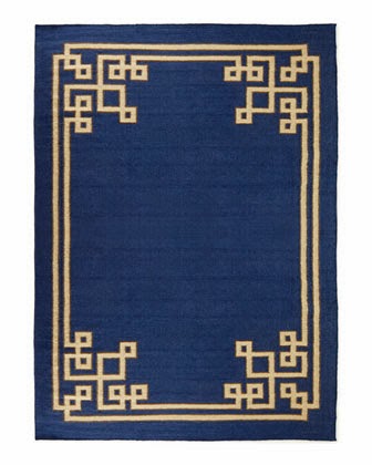
The room felt pretty traditional so we wanted a graphic rug to modernize the space a bit. We liked these options:
She decided all the options were a bit too contemporary for her so we started looking for more traditional options.
We thought the Gobi Wool rug would be a good option. We liked how much blue it brought into the space.
We also liked the Safavieh Vintage Turquoise rug.
We ended up finding this Damara Rug and she liked it the best!
I'll be posting the reveal tomorrow! Here is a little sneak peak....
photo by Jylare Smith Photography


0 Response to "Blue & Gray Living Room Planning "
Post a Comment